A visual identity is not only a logo. The logo is one part of a larger system that includes colour, typography, graphic elements, imagery, and the design of marketing materials. Its purpose is to make the brand recognisable before the name is read and consistent wherever customers encounter it.
Begin With Brand Strategy
Before drawing, understand the business, audience, competitors, personality, and value the brand should represent. Ask what the customer should feel and which position the brand should own in their mind. Without these answers, a logo may be attractive but unrelated to the business.
The Logo Is a Mark Inside a System
A logo should be clear, distinctive, scalable, and suitable for digital and print use. Test it in black and white, on different backgrounds, as a favicon, profile image, and sign. Horizontal, vertical, and symbol-only versions may be required without changing its core character.
Colour and Typography Carry Personality
Colour influences perception, but selection must consider contrast, accessibility, screens, and print production. Typography establishes the voice of the brand. Choose a system that supports Arabic and English when required and defines the hierarchy for headings, paragraphs, and numbers.
Graphic Elements, Imagery, and Motion
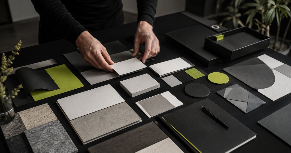
An identity can include patterns, icons, shapes, photography direction, and motion principles. These components give teams tools to create varied communication without using the logo as the only visual solution. Every element should have a purpose and rule.
Guidelines Protect the Investment
Useful brand guidelines define safe space, minimum sizes, backgrounds, colours, type, correct and incorrect use, and application examples. The document is not only a presentation. It is an everyday tool that helps employees and suppliers implement the identity accurately.
Test the Identity in Real Applications
Before approval, apply the system to social content, the website, presentations, packaging, print, and uniforms. Real applications reveal whether the system is flexible or incomplete. A strong identity works across many dimensions and materials, not only in one mockup.
Consistency Does Not Mean Rigidity
Protect the core rules while leaving room for campaigns and seasons. Photography, secondary colours, and compositions can change while the brand remains recognisable. True consistency means preserving character rather than copying one design forever.
Active Media 360 begins branding projects by understanding the business, audience, and competitive context, then develops the logo, visual system, guidelines, and applications. Tell us if your brand needs a new identity or a stronger version of its current system.